

*Project Disclaimer: This is a personal redesign of the Simply Salad mobile app, aimed at improving user experience and visual design. This project was not created in partnership with Simply Salad, but rather as an independent initiative to showcase my UX design skills. ✨
Problem Statement
Simply Salad’s redesigned mobile app seeks to streamline the custom ordering and checkout experience for customers ordering salads for pick-up or delivery. Usability testing will assess how easily users can navigate key tasks, focusing on ease of use, time efficiency, and content clarity to refine the app’s design for an optimal user experience.
Hypothesis
By simplifying the customization and checkout processes in the Simply Salad app, users will be able to complete their orders more efficiently and with greater satisfaction. We expect that users will find the redesigned app intuitive and that they will require minimal guidance to navigate tasks, resulting in a positive impact on their likelihood to use the app for future orders.
Business Goals
Goal No. 1
As a new user, I want to be able to mobile order as a guest for the fastest mobile ordering process.
Goal No. 2
As a new user, I want to be able to easily review my salad order with visuals and simple UI.
Goal No. 3
As a consumer, I want a seamless Checkout Process with multiple checkout options.
Solutions
Core Task #1: Fixing UI Accessibility Issues Throughout the Simply Salad App
With the myriad of accessibility issues found through the app, showing the stark difference in the homepage was important to showcase. A good portion of the user interface was crowded and difficult to read, so I was on a mission to fix these usability issues for users starting with the home page.

Core Task #2: Reduce Scroll Time During Salad Creation
During my initial usability test of the Simply Salad App, the average time spent creating your own customized salad was 4 minutes with 50 seconds. After the second iteration of my Simply Salad app redesign, the average time spent was drastically reduced to 2 minutes with 50 seconds. With these difference of 2 minutes, users were more content with visuals instead of words to aid the salad creation process.

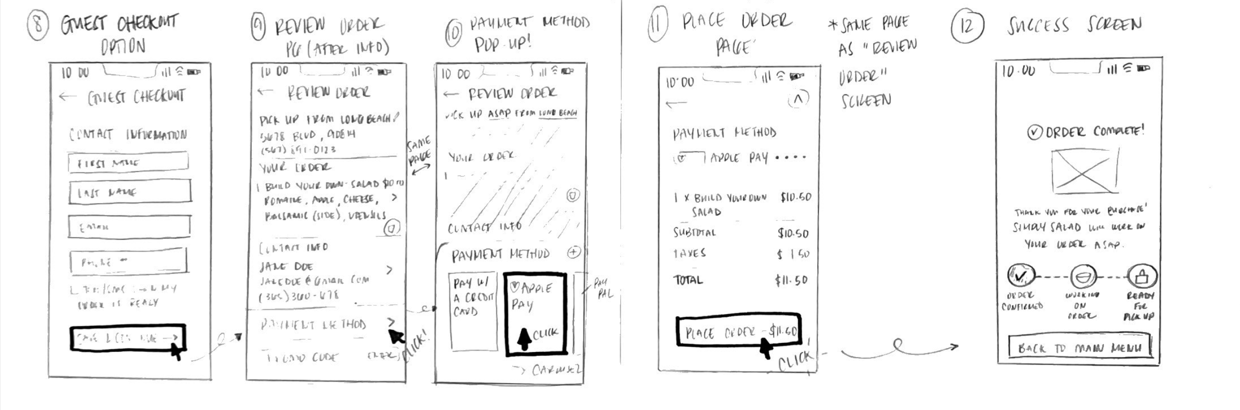
Core Task #3: Streamlining the Checkout Process
During previous usability testing, users mentioned that the checkout process of the Simply Salad app was overwhelming due to the crowded UI on the checkout screen. They also had a hard time reading the ingredients of the salad they had just created. With my final iteration of the order preview/checkout screen, I spaced items out to have more breathing room to reduce users feeling overwhelmed during this stage of the process.

Research
Competitive Research
After conducting a comparative analysis on three Simply Salad competitors currently in the market, only one had perfected all 3 features that I aimed to enhance on the Simply Salad app.

User Interviews
100% of my participants thought the Simply Salad app was an endless scroll of options.
After conducting a usability test of the current Simply Salad mobile app, most of my participants were frustrated with the endless scroll of ingredient lists with no pictures or visuals.
During user interviews, participants were asked questions such as:
What are you thinking as you view the customization page for building your own custom salad?
How do you feel about the options available for customizing your salad?
What did you find most and least enjoyable about using the app?
Affinity Mapping
Based on the trends found in my affinity mapping, my users wanted more visuals, less words, & a simpler user interface.

So, what were my main action items?

Persona: Jennifer, The ON-The-Go Medical Assistant.

Initial Sketches


User Flow Map ✨

Testing & Iterations
Low fidelity Usability Testing


My first round of usability testing aimed to identify whether users would feel like the mobile ordering process was streamlined and intuitive enough to comfortably customize their own salad with ease in order to increase Simply Salads user experience. The three main issues found were thankfully minor user interface issues that were fixed in the high fidelity designs.
High Fidelity User Testing (Second Iteration)


The second round of usability testing aimed to fixed usability or UI issues found in my first iteration of the Simply Salad app redesign. Most of the issues found during this round of testing were minor user interface issues that were easily fixed.
Simply Salad Redesign Style Guide

Created a simple design system for my redesign of the Simply Salad mobile app, changing the UI for how ingredients are displayed, the bottom navigation bar, and creating a progress bar to track mobile order status.
Final Screens


Interactive Prototype
Lessons Learned.
Final Thoughts & Take Aways…
Working on this redesign was such an inspiring process, it truly showed me the value in taking time to deeply synthesize users needs and use these processes to enhance future projects of my own.
Enhancing Customization Flow Leads to Lower Drop-Off Rates During Food Orders
Streamlining the Checkout Process Significantly Reduces Cart Abandonment Rates
The original customization UI was overwhelming, particularly for building a salad, with too much text and a lengthy process that caused users to abandon their orders. To address this, we streamlined the flow by reducing text, grouping options into clear categories, and adding visual cues and progress indicators. This made the process faster and more intuitive, hopefully reducing the drop in abandonment rates during the customization stage and improved overall user satisfaction.
By simplifying this process, adding clear calls to action, and integrating a more seamless payment experience, we observed a noticeable reduction in cart abandonment. This reinforces the importance of designing frictionless, user-friendly transactions, especially for mobile food ordering apps where convenience and speed are key to user retention. Future improvements can focus on further personalizing the experience by integrating features like saved preferences and one-click ordering for repeat customers.